I’m currently in the process of putting the finishing touches on the Android version of Find My Train. Since design detail is a major focus in the app, I’m delving deeper into some of the UI elements than might be done on a typical app. My most recent change was to tweak the color of the tabs on the action bar to match the color scheme of the app. This turned out to be surprisingly tricky, so I’m documenting it here. The default color looked like this:
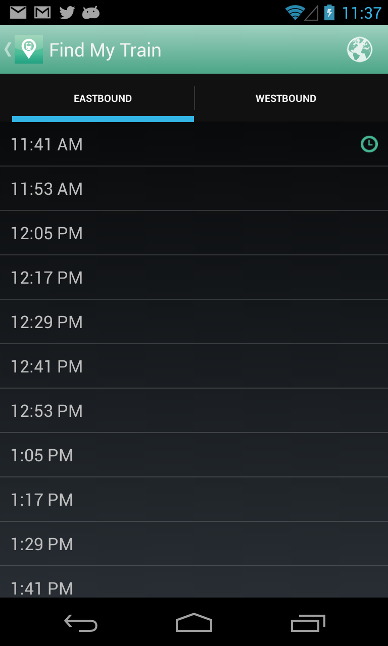 As you can see, the little indicator of the active tab is a blue color that doesn’t really go along with the rest of the app. So, looking into this, there’s a bit of info in the official android docs here:
http://developer.android.com/guide/topics/ui/actionbar.html#Style
However, it doesn’t go into much detail about how to actually style the tabs. I wandered through a lot of stack overflow questions about it, but wasn’t very satisfied with any of the answers I saw. I also found this site which generates tab bar styles automatically for you:
http://jgilfelt.github.io/android-actionbarstylegenerator/
I tried it out, and it generated a huge number of resource files, plus it was using images for the solid color parts, so I wasn’t very happy with it.
Finally, I checked out some of the sample code for ActionBarSherlock here:
https://github.com/JakeWharton/ActionBarSherlock/tree/master/actionbarsherlock-samples/styled
This gave me an idea of how the style needed to be structured, but seemed incomplete (I couldn’t find some of the referenced drawables, like “ad_tab_unselected_holo”). Between the two examples, I was eventually able to figure things out and build a working solution.
How Action Bar tabs are styled
To control the style on the tabs, you’ll need to do the following:
- Create a custom theme for your app, which you’ll probably want to put in styles.xml, and reference your tab styles for each part you want to customize
- Create styles for each part of the tabs
- Set your app to use the custom theme via AndroidManifest.xml
There are several parts of the tabs that you can customize, and the official documentation seems a little misleading on what they do, so I’ll rephrase here:
- actionBarTabStyle – This determines the style of the tabs themselves. The tab is the area that includes the text, its background, and the little indicator bar under the text. If you want to customize the indicator like I did, you need to alter this one.
- actionBarTabBarStyle – This determines the style of the overall tab bar. It includes the whole container that includes all of the tabs.
- actionBarTabTextStyle – this one I didn’t use, so I’ll assume the official docs explain it properly.
To give you a better idea of how the actionBarTabStyle and actionBarTabBarStyle work, I’ve included a screenshot below, where the actionBarTabStyle has the background set to red, and the actionBarTabBarStyle has the background set to blue. You can see how the blue background covers the whole tab bar area, and the red backgrounds cover each tab.

Changing the indicator color
My main goal was to change the indicator color under the active tab, but I also wanted to change the highlight color that shows up when the user clicks the tab. Here’s how I ended up doing it:
- Create the theme for the app, the action bar, and the tabs. We need to set the background for the tabs to the “tab_bar_background” drawable.
This file contains hidden or bidirectional Unicode text that may be interpreted or compiled differently than what appears below. To review, open the file in an editor that reveals hidden Unicode characters. Learn more about bidirectional Unicode characters<style name="FindMyTrain" parent="Theme.Sherlock"> <item name="android:actionBarTabStyle">@style/FindMyTrain.ActionBar.Tab</item> <item name="actionBarTabStyle">@style/FindMyTrain.ActionBar.Tab</item> </style> <style name="FindMyTrain.ActionBar.Tab"> <item name="android:background">@drawable/tab_bar_background</item> </style> - Next, create the tab_bar_background drawable. This will be a state list drawable, which has different visual appearance depending on whether the tab is selected and/or pressed. In the state list, we’ll reference two other drawables for when the button is selected, and we’ll just use a plain color for the unselected states:This file contains hidden or bidirectional Unicode text that may be interpreted or compiled differently than what appears below. To review, open the file in an editor that reveals hidden Unicode characters. Learn more about bidirectional Unicode characters
<?xml version="1.0" encoding="utf-8"?> <selector xmlns:android="http://schemas.android.com/apk/res/android"> <item android:state_focused="false" android:state_selected="false" android:state_pressed="false" android:drawable="@color/transparent"/> <item android:state_focused="false" android:state_selected="true" android:state_pressed="false" android:drawable="@drawable/tab_bar_background_selected"/> <item android:state_selected="false" android:state_pressed="true" android:drawable="@color/tab_highlight"/> <item android:state_selected="true" android:state_pressed="true" android:drawable="@drawable/tab_bar_background_selected_pressed"/> </selector> - We’ll also need to create a colors.xml file to define the two colors we used in the state list drawable:This file contains hidden or bidirectional Unicode text that may be interpreted or compiled differently than what appears below. To review, open the file in an editor that reveals hidden Unicode characters. Learn more about bidirectional Unicode characters
<?xml version="1.0" encoding="utf-8"?> <resources> <color name="transparent">#00000000</color> <color name="tab_highlight">#ff9ecfbf</color> </resources> - Now, we need to create the drawables for the different backgrounds. The indicator under the active tab comes from the background drawable, so in our custom version, we’ll include an indicator in the proper color. To do this, I used a hack where I create a layer list with a rectangle shape with a 5dp stroke around the exterior, then offset the rectangle so that the top, left and right sides are outside the bounds of the view, so you only see the bottom line. This works pretty well, but if you know a better way to accomplish this, I’d be very interested to hear about it. In the case of the “pressed” version, the fill color is set on the rectangle to indicate that it is pressed.This file contains hidden or bidirectional Unicode text that may be interpreted or compiled differently than what appears below. To review, open the file in an editor that reveals hidden Unicode characters. Learn more about bidirectional Unicode characters
<?xml version="1.0" encoding="utf-8"?> <layer-list xmlns:android="http://schemas.android.com/apk/res/android"> <item android:top="-5dp" android:left="-5dp" android:right="-5dp"> <shape android:shape="rectangle"> <stroke android:color="#ff4ba587" android:width="5dp"/> </shape> </item> </layer-list> This file contains hidden or bidirectional Unicode text that may be interpreted or compiled differently than what appears below. To review, open the file in an editor that reveals hidden Unicode characters. Learn more about bidirectional Unicode characters<?xml version="1.0" encoding="utf-8"?> <layer-list xmlns:android="http://schemas.android.com/apk/res/android"> <item android:top="-5dp" android:left="-5dp" android:right="-5dp"> <shape android:shape="rectangle"> <stroke android:color="#ff4ba587" android:width="5dp"/> <solid android:color="@color/tab_highlight"/> </shape> </item> </layer-list> - Now our styles and theme are completely set up, so the last step is to apply the theme in AndroidManifest.xml. In my case, I did this by setting the theme on the application element, but you can also set it per-activity instead:This file contains hidden or bidirectional Unicode text that may be interpreted or compiled differently than what appears below. To review, open the file in an editor that reveals hidden Unicode characters. Learn more about bidirectional Unicode characters
<application android:allowBackup="true" android:icon="@drawable/ic_launcher" android:label="@string/app_name" android:theme="@style/FindMyTrain" android:name=".FindMyTrainApplication" >
Once all of this is set up, we run the app and see that the indicator is the right color:
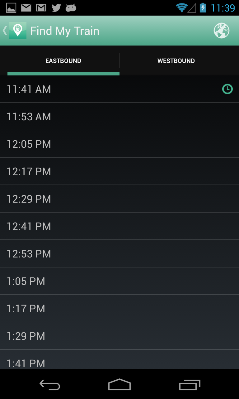 Success!
 Al's Blog